C4.2.20—Keeling Curve analysis
Keeling Curve analysis explains how energy flow, matter cycling, trophic transfer or carbon movement is represented, measured or limited within ecosystems.
- Syllabus
- First assessment 2025
- Objective
- C4.2.20
- Level
- HL
Keeling Curve analysis explains how energy flow, matter cycling, trophic transfer or carbon movement is represented, measured or limited within ecosystems.
Coverage 2024–2025 · Updated 16 Jul 2026
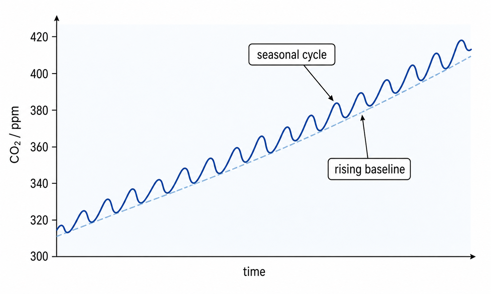
The Keeling Curve shows both a long-term rise in atmospheric CO₂ and repeated annual fluctuations.
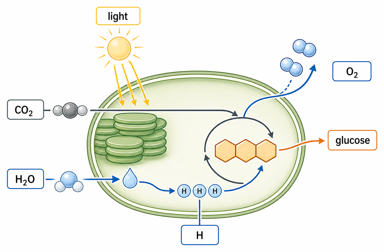
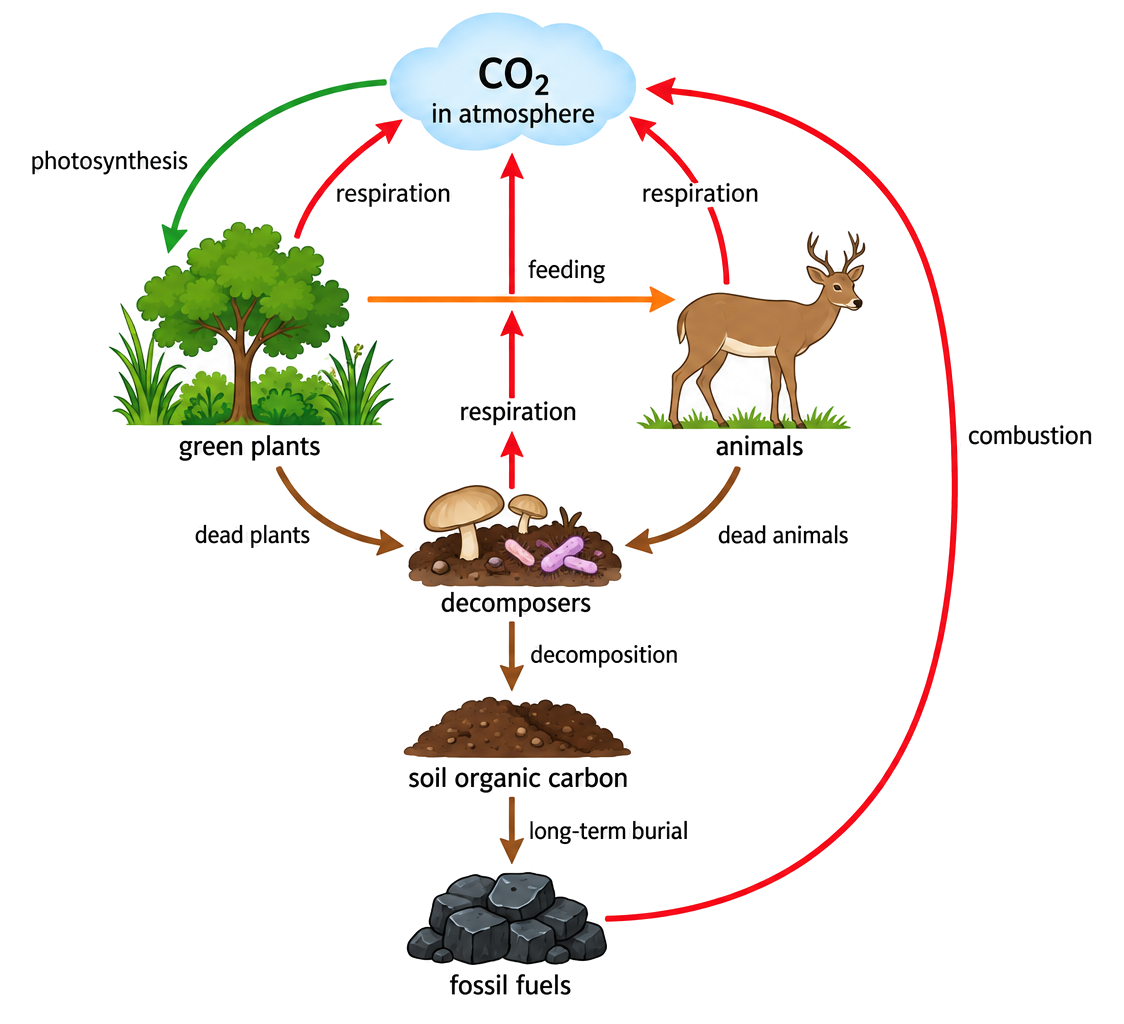
Seasonal photosynthesis and respiration, especially across Northern Hemisphere land ecosystems, create the annual oscillation: growing-season uptake lowers CO₂, while reduced photosynthesis and continuing respiration raise it later.
Over many years, CO₂ peaks and troughs both shift upward because combustion adds carbon faster than global sinks remove the additional amount.
When reading the curve, compare equivalent points in successive years to identify the long-term trend; do not mistake one seasonal decline for a reversal of the multi-year rise.
Photosynthesis, respiration and combustion explain different components of the pattern. Axis units and time scale must be checked before interpreting magnitude or rate.
This objective is assessed through multiple choice, commonly using Identify.
Identify
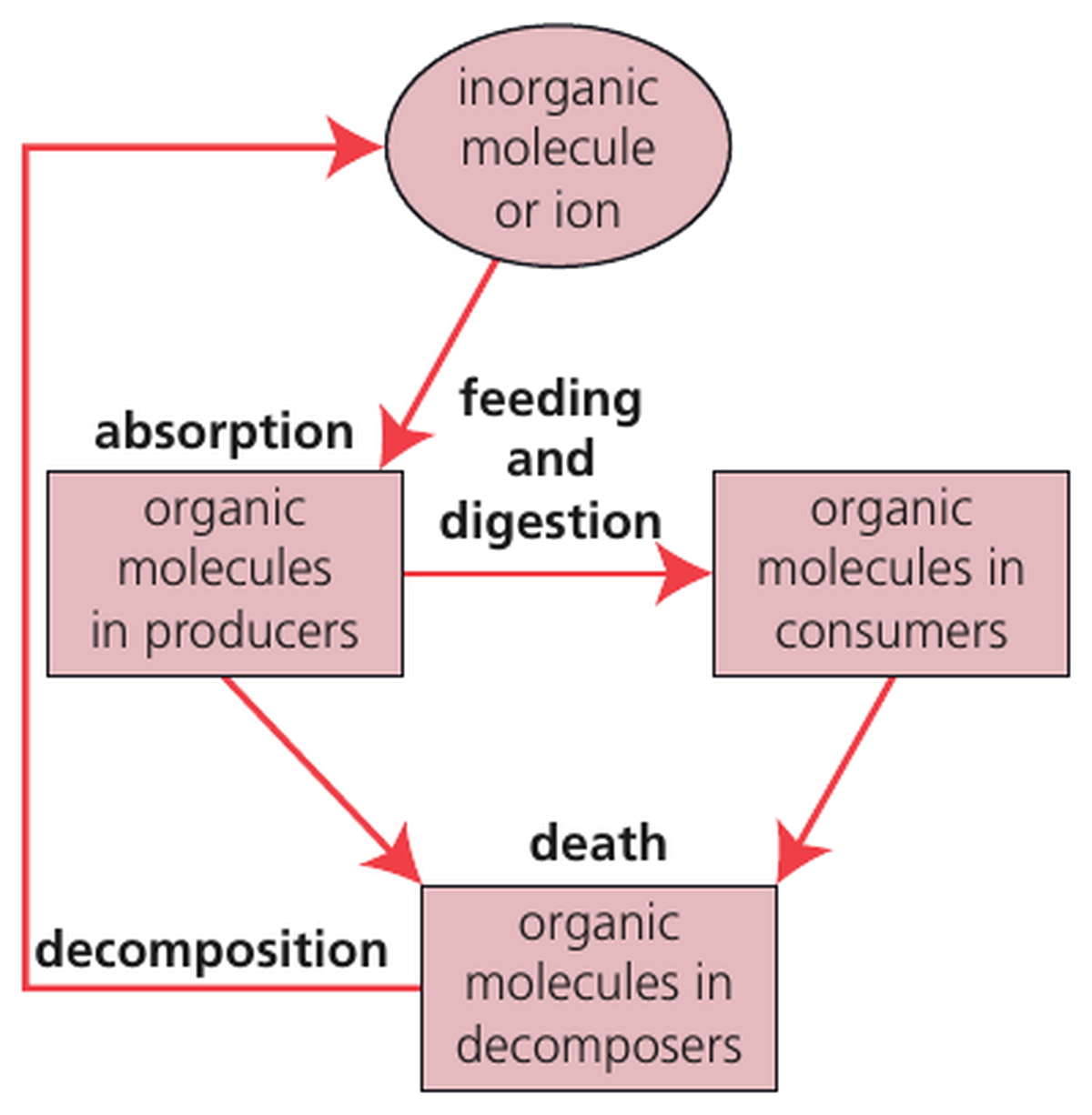
Build the answer around this relationship: Keeling Curve analysis must be linked to the correct source, store, transfer or loss process.
Reversing photosynthesis and respiration arrows in carbon-cycle diagrams.
Representative question
The graph shows data collected at Mauna Loa, USA, for monthly mean carbon dioxide concentration.
What causes the decreases in monthly mean carbon dioxide concentration each year?
Combustion increases.
Respiration increases.
Decomposition increases.
Photosynthesis increases.
D