
Question 21
[Maximum number: 1]
The diagram shows selected US labour statistics from 2001 to 2013.
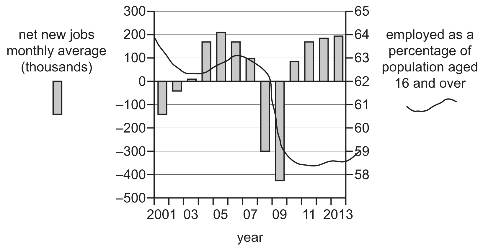
What can be concluded from the diagram?
A
Between 2004 and 2005, when the number of net new jobs was rising, the percentage employed increased.
B
Employed as a percentage of the population aged 16 and over declined continuously.
C
The natural rate of unemployment was achieved only in 2008.
D
The number of employed workers rose in all except four years.