CAIE AS Maths Statistics 1: Data Representation, Stem-and-Leaf, and Box Plots
A source-backed CAIE Mathematics guide for CAIE AS Maths Statistics 1 data representation, using EduNinja PDF notes, worked examples, and markscheme-style answers.
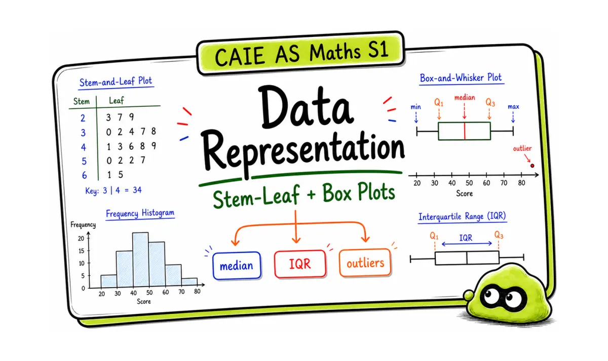
CAIE AS Maths Statistics 1 data representation questions look simple until the wording asks you to compare, justify, or interpret. A graph alone rarely earns full marks. You need to choose the right display, read values with care, and write one clear sentence about centre, spread, skew, or outliers.
If you only remember one thing: do not describe a diagram with everyday words like "bigger" or "better". Use the statistic that supports the claim. For box plots, that usually means median and interquartile range. For histograms, it means frequency density. For stem-and-leaf diagrams, it means ordered raw values, median, range, and shape.
Useful starting points:
- A-Level Mathematics Notes
- CAIE AS Maths Statistics 1 Question Bank
- AS Maths 9709 Statistics1 Znotes v2
Use the notes to rebuild the method, then move into question practice. Do not open every link at once. One corrected Statistics 1 answer is worth more than a long page of marked notes.
Quick answer
- CAIE AS Maths Statistics 1 data representation covers how to display, read, and compare data.
- Stem-and-leaf diagrams keep the original values visible, so they are useful for median, range, and shape.
- Box plots show median, quartiles, interquartile range, range, and possible outliers.
- Histograms use frequency density on the vertical axis when class widths are unequal.
- Cumulative frequency graphs help you estimate medians, quartiles, percentiles, and interquartile range.
- A comparison answer should quote a statistic before explaining what it means.
- Back-to-back stem-and-leaf diagrams are useful when comparing two small data sets.
- Outliers are often checked using lower quartile - 1.5 x IQR and upper quartile + 1.5 x IQR.
- In histograms, frequency is bar area, not bar height.
- For cumulative frequency, read quartiles and percentiles from the curve, then quote the value in context.
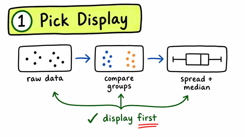
Choose the display before you calculate
Many lost marks come from using the right idea in the wrong setting. Before you draw or calculate, decide what the data looks like and what the question wants.
| Display | Best use | Statistic or feature to mention |
|---|---|---|
| Stem-and-leaf diagram | Small or medium sets where raw values matter | Median, range, mode, shape |
| Box plot | Comparing centre and spread between data sets | Median, quartiles, IQR, outliers |
| Histogram | Continuous grouped data | Class width, frequency density, area |
| Cumulative frequency graph | Estimating position in a data set | Median, quartiles, percentiles, IQR |
| Bar chart | Discrete categories | Frequency or percentage in each category |
The exam may not ask, "Which graph should you use?" in those exact words. It may give you grouped continuous data, unequal class intervals, or two data sets to compare. Those details tell you which display and which statistic the marker expects.
Stem-and-leaf diagrams: keep the raw data visible
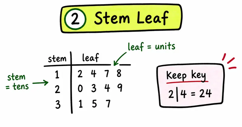
A stem-and-leaf diagram organizes data while keeping every original value. That is why it works well for small data sets. You can still find the median, range, mode, and unusual values without returning to the original list.
A safe stem-and-leaf answer includes:
- Put the values in order.
- Use a clear key, such as
3 | 7 means 37. - Keep the leaves aligned and ordered.
- Use the ordered values to find the median or range.
A common mistake is forgetting the key. Without the key, the marker cannot tell whether 4 | 2 means 42, 4.2, or another scale.
Weak:
- A stem-and-leaf diagram is useful because it shows the data.
Better:
- A stem-and-leaf diagram keeps the original data values in order, so the median, range, and shape of the distribution can be read from the diagram.
Back-to-back stem-and-leaf diagrams
A back-to-back stem-and-leaf diagram compares two related data sets using the same stems. It is useful when you want to compare centre, spread, shape, or unusual values while still keeping the raw data visible.
Always include a key. For example:
3 | 7 means 37
If the two sides use the same stem, make sure the leaves are ordered on both sides. Students often sort one side correctly and leave the other side in the original order.
Box plots: compare median and IQR separately
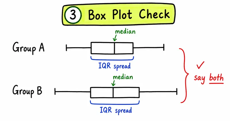
Box plots are built for comparison. They show where the middle value is and how spread out the middle 50 percent of the data is. In CAIE Statistics 1, a good comparison usually mentions median for centre and interquartile range for spread.
| Feature | What it tells you | How to write about it |
|---|---|---|
| Median | Typical central value | "The median is higher, so the typical value is higher." |
| IQR | Spread of the middle 50 percent | "The larger IQR shows less consistency." |
| Range | Overall spread | "The total spread is larger, but this may be affected by extremes." |
| Outlier | Unusual value | "The value may be an outlier if it lies beyond the expected range." |
| Skew | Shape of the distribution | "The longer upper whisker suggests positive skew." |
Avoid saying one box plot is "better". That word does not name a statistical feature. Say what is higher, lower, wider, narrower, more consistent, or less consistent, and support it with the correct statistic.
How to compare two box plots
A strong CAIE Statistics 1 comparison should usually include two separate comments:
- Compare the medians to discuss the typical value.
- Compare the interquartile ranges to discuss consistency or spread.
Use this answer frame:
The median for data set A is higher/lower than data set B, so the typical value is higher/lower. The IQR for data set A is smaller/larger, so the middle 50 percent of values are more/less consistent.
Do not say one data set is better unless the context defines what better means. If the question is about reliability, consistency may matter. If the question is about performance, the median may matter more.
Outliers and the 1.5 x IQR rule
In many Statistics 1 questions, an outlier can be checked using the interquartile range.
IQR = Q3 - Q1 lower boundary = Q1 - 1.5 x IQR upper boundary = Q3 + 1.5 x IQR
A value below the lower boundary or above the upper boundary may be treated as an outlier. If you mention an outlier in a written comparison, explain it using the boundary or the diagram evidence.
Histograms: area represents frequency
Histograms cause problems because students often treat them like bar charts. In a histogram, the area of each bar represents frequency. If the class widths are unequal, the bar height is frequency density, not frequency.
Use this formula:
frequency density = frequency / class width
If a question gives frequency density and asks for frequency, rearrange it:
frequency = frequency density x class width
Check the class widths before drawing. Equal class widths are easier, but CAIE often tests whether you notice unequal intervals. A tall narrow bar can have a smaller frequency than a shorter wide bar because area, not height alone, represents frequency.
Worked example: histogram frequency density
A class interval from 20 to 35 has frequency 45.
Class width:
35 - 20 = 15
Frequency density:
frequency density = frequency / class width frequency density = 45 / 15 = 3
The histogram bar height should be 3. If the question gives frequency density instead, use:
frequency = frequency density x class width
Cumulative frequency: read from the curve, then interpret
Cumulative frequency graphs help you estimate values by position. You usually read across from a cumulative frequency value to the curve, then down to the data axis.
For a data set with n values:
- Median is around the
n / 2value. - Lower quartile is around the
n / 4value. - Upper quartile is around the
3n / 4value. - Interquartile range is upper quartile minus lower quartile.
Write the answer with units if the context has units. A median of 24 may not be enough if the data is time, mass, height, or score. "24 minutes" is clearer and safer.
Worked example: cumulative frequency quartiles
A cumulative frequency graph represents 80 students.
Median position:
80 / 2 = 40th value
Lower quartile position:
80 / 4 = 20th value
Upper quartile position:
3 x 80 / 4 = 60th value
Read across from 20, 40, and 60 on the cumulative frequency axis to the curve, then down to the data axis. Then calculate:
IQR = upper quartile - lower quartile
Give the answer with units if the context has units.
Weak answer vs mark-worthy answer
| Prompt | Weak answer | Why it loses marks | Mark-worthy answer |
|---|---|---|---|
| Compare two box plots | The second box plot is bigger. | "Bigger" does not name a statistic. | The second data set has a larger IQR, so the middle 50 percent of values are more spread out. |
| Explain a histogram bar | This bar is the highest, so it has the most people. | Height is not frequency when class widths differ. | The frequency is found from bar area, so use frequency density multiplied by class width. |
| Interpret a stem-and-leaf diagram | It is easy to read. | Too vague for a method mark. | It keeps the original values visible and ordered, so the median and range can be found. |
| Compare consistency | Data set A is more consistent. | The evidence is missing. | Data set A has the smaller IQR, so its middle 50 percent of values are less spread out. |
The better answers are not much longer. They earn marks because they name the statistic, connect it to the graph, and explain the meaning in context.
Worked example 1: stem-and-leaf diagram
Question: Why is a stem-and-leaf diagram useful for a small data set?
Markscheme-style answer: It keeps the original values visible while arranging them in order, so the median, range, and shape of the data can be inspected.
Why this scores: The answer does more than say "it shows the data". It explains what the display lets you do with the data.
Worked example 2: two box plots
Question: What should you include when comparing two box plots?
Markscheme-style answer: Compare the medians for centre and the interquartile ranges for spread. Mention outliers or skew only if the diagram supports that comment.
Why this scores: It separates centre from spread. It also avoids making a shape comment unless the graph gives evidence for it.
Worked example 3: histogram with unequal class widths
Question: A class interval has width 10 and frequency density 3.2. Find the frequency.
Method:
frequency = frequency density x class width frequency = 3.2 x 10 frequency = 32
Markscheme-style answer: The frequency is 32.
Why this scores: The method uses area, not bar height alone. That is the main histogram idea CAIE wants you to apply.
Question-type breakdown
Sort the prompt before you start writing. Statistics 1 questions often test answer shape as much as calculation.
| Question type | What the examiner is testing | First move | Common trap |
|---|---|---|---|
| Draw a stem-and-leaf diagram | Ordering and presentation | Sort the values and add a key | Missing or unclear key |
| Compare box plots | Centre and spread | Compare median and IQR separately | Saying "more spread" without evidence |
| Draw a histogram | Frequency density | Check class widths first | Using frequency as bar height |
| Use cumulative frequency | Reading estimates from a curve | Locate median or quartile position | Reading from the wrong axis |
| Choose a display | Matching data type to graph | Identify discrete, continuous, grouped, or raw data | Using a familiar graph instead of the right graph |
This is where many students lose easy marks. They know the topic, but the answer does not match the command word.
Mini revision route
- Pick one display: stem-and-leaf, box plot, histogram, or cumulative frequency.
- Write the statistic linked to that display.
- Do one short exam-style question.
- Mark the first missing reasoning step.
- Rewrite the answer in one better sentence.
That last step matters. If your first answer says "the graph is bigger", rewrite it as "the IQR is larger, so the middle 50 percent of values are more spread out." The corrected wording is the part you want to remember.
Common mistakes that cost marks
- Forgetting the key on a stem-and-leaf diagram.
- Comparing box plots without mentioning median or IQR.
- Treating histogram height as frequency when class widths are unequal.
- Reading cumulative frequency from the wrong axis.
- Describing a pattern without quoting a value.
- Using "consistent" without supporting it with spread.
- Forgetting units when the data has units.
The fastest repair is to write the missing phrase next to the answer. Do not only mark the answer key. Turn the correction into a sentence you could write under exam pressure.
Exam-ready checklist
- Did I identify the type of data: raw, grouped, continuous, or categorical?
- Did I choose the right display for that data?
- Did I use median and IQR correctly for box plots?
- Did I use frequency density for histograms?
- Did I read cumulative frequency values from the curve in the right direction?
- Did I support every comparison with a statistic?
- Did I include units where the context needs them?
How EduNinja helps
Use this page as the explanation layer for CAIE AS Maths Statistics 1 data representation. Then use the notes and question bank to practise the exact answer move: choose the display, calculate or read the value, and write the interpretation.
A good study loop is short. Read the rule, answer one question, mark the missing wording, and save the corrected sentence. Then move to the next display.
Related Study Links
FAQ
How do I compare two box plots in CAIE Statistics 1?
Compare the medians for centre and the interquartile ranges for spread. If the question asks about consistency, the smaller IQR usually means the data is more consistent. Mention outliers or skew only when the diagram supports it.
What is the difference between frequency and frequency density?
Frequency is the number of values in a class. Frequency density is frequency divided by class width. In a histogram with unequal class widths, frequency density gives the bar height and bar area represents frequency.
Why does a stem-and-leaf diagram need a key?
The key explains the scale of the values. For example, 4 | 7 means 47 tells the marker how to read each stem and leaf.
When should I use a cumulative frequency graph?
Use cumulative frequency when you need estimates for median, quartiles, percentiles, or interquartile range from grouped data.
Why do statistics answers need words?
Many marks come from interpretation. A calculation may be correct, but the answer still needs to say what the statistic shows about the data set.
How do I know if a value is an outlier in Statistics 1?
Use the 1.5 x IQR rule if the question expects a calculated check. Find Q1, Q3, and IQR, then compare the value with Q1 - 1.5 x IQR and Q3 + 1.5 x IQR.
What does area mean in a histogram?
Area represents frequency. The height is frequency density when class widths are unequal, so a taller bar does not always mean a larger frequency.
What should I write when comparing two distributions?
Compare centre and spread separately. Use median for centre and IQR for spread, then explain what those values mean in the context of the question.
Related study links
- A-Level Mathematics Question Bank
- A-Level Mathematics Notes
- AS Maths 9709 Statistics1 Znotes v2
- EduNinja study guides
- CAIE AS Maths quadratics
Use the links as a study path: rebuild the method, practise the closest matching question, then move on after correcting one mistake.
Closing
CAIE AS Maths Statistics 1 data representation becomes easier when you stop treating graphs as drawings and start treating them as evidence. Pick the display, name the statistic, quote the value, and explain what it shows.
Put CAIE back into your full A-Level CAIE Mathematics AS study plan.
Return to the complete course overview, or move directly into the most relevant study tool.
Related articles
More course notes, updates and study resources from the EduNinja blog.
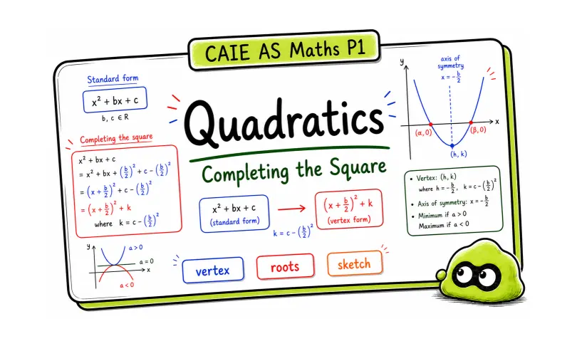
CAIE AS Maths Pure 1 Quadratics: Completing the Square and Sketching Graphs
A source-backed CAIE Mathematics guide for CAIE AS Maths quadratics, using EduNinja PDF notes, worked examples, and markscheme-style answers.
Piecewise Functions Explained | IB Maths AA
Revise IB Maths AA piecewise functions with interval rules, endpoint notation, graphs, evaluation steps, common mistakes and practice.
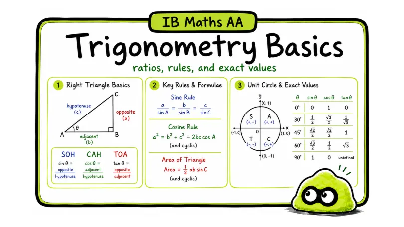
Trigonometry Basics for Exams | IB Maths AA
Learn IB Maths AA trigonometry basics with SOH CAH TOA, sine and cosine rules, area, unit-circle signs, exact values and exam practice.