CAIE IGCSE Mathematics Core Drawing Statistical Diagrams

Practise converting frequencies into accurately scaled charts and arranging raw values into ordered stem-and-leaf diagrams with an unambiguous key.

Syllabus
2028–2030
Objective
C9.4.1
Level
Core

Exam points

  • calculate each pie-chart sector as its frequency proportion of 360° before drawing the radius
  • apply the given axis scale or pictogram key consistently when completing missing categories
  • sort every leaf within its stem and write a key that identifies the represented number and unit

C9.4.1 Draw and interpret: (a) bar charts (b) pie charts (c) pictograms (d) question 1

[Maximum number: 3]

Miguel works in an office.

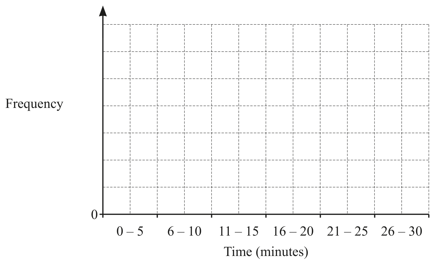
Figure for Question C9.4.1 Draw and interpret: (a) bar charts (b) pie charts (c) pictograms (d) question 1 — CAIE IGCSE Mathematics Core

Miguel records the length of time of each telephone call he receives, correct to the nearest minute.
The recorded times are shown in the table.

Draw a bar chart to show this information.

Complete the scale on the frequency axis.

Figure for Question C9.4.1 Draw and interpret: (a) bar charts (b) pie charts (c) pictograms (d) question 1 — CAIE IGCSE Mathematics Core
All question bank results loaded